Your montage might have the cleanest snipes and the smoothest edits, but if the thumbnail looks like it was thrown together in MS Paint during a loading screen, nobody’s clicking. In 2026, Fortnite’s YouTube and TikTok scenes are more saturated than ever, thousands of montages drop daily, and viewers scroll past 90% of them based on the thumbnail alone.
A solid Fortnite montage thumbnail isn’t just decoration. It’s the difference between 200 views and 20,000. It tells potential viewers what kind of gameplay they’re about to see, sets the tone for your editing style, and, if done right, makes them curious enough to stop scrolling. Whether you’re grinding for a creator code or just want your squad to hype up your clips, learning to design thumbnails that actually perform is non-negotiable.
Table of Contents
ToggleKey Takeaways
- A Fortnite montage thumbnail drives click-through rate (CTR) and algorithmic reach; thumbnails converting at 8-10% receive exponentially more visibility than those at 2-3%.
- High-performing thumbnails feature dynamic character positioning with action shots, bold readable fonts (3-5 words max), and high-contrast color schemes that pop on mobile devices.
- Character layering, skin choice, and strategic text placement create visual depth; OG skins signal legacy while trending cosmetics keep content fresh and relevant to active players.
- Glitch and cyberpunk aesthetics dominate 2026 trending styles, but minimalist designs offer longevity and avoid looking dated; match thumbnail style to your montage’s content and tone.
- Essential tools range from Adobe Photoshop (industry standard) to free alternatives like Photopea and GIMP; export Fortnite montage thumbnails as JPG at 90% quality in 1280×720 pixels for YouTube.
- A/B test thumbnail performance, track CTR metrics, maintain brand consistency with logos and signature color palettes, and design vertical variants for TikTok and Instagram cross-posting.
Why Your Fortnite Montage Thumbnail Matters More Than Ever
Platform algorithms don’t care about your 30-second intro or your sick transitions, they care about click-through rate (CTR). YouTube’s recommendation engine, TikTok’s For You page, and Instagram’s Explore tab all prioritize content that grabs attention fast. If your thumbnail doesn’t hook viewers in the first half-second of their scroll, the algorithm buries your video before it even has a chance.
Fortnite content specifically faces brutal competition. The game’s been out since 2017, and by 2026, the montage meta has evolved into a full-blown art form. Top creators like Clix, Peterbot, and Aussie spend serious time (or hire designers) to craft thumbnails that pop. They know that even if your gameplay is cracked, a weak thumbnail signals low effort, and viewers assume the edit quality will match.
CTR isn’t just vanity metrics, either. A thumbnail that converts at 8-10% will get exponentially more reach than one hovering at 2-3%. That’s the difference between your montage hitting a few hundred views from your existing subs versus breaking into five or six figures through organic discovery. In a scene where everyone’s fighting for eyeballs, your thumbnail is your first, and sometimes only, pitch.
Essential Elements of a High-Performing Fortnite Montage Thumbnail
Character Positioning and Action Shots
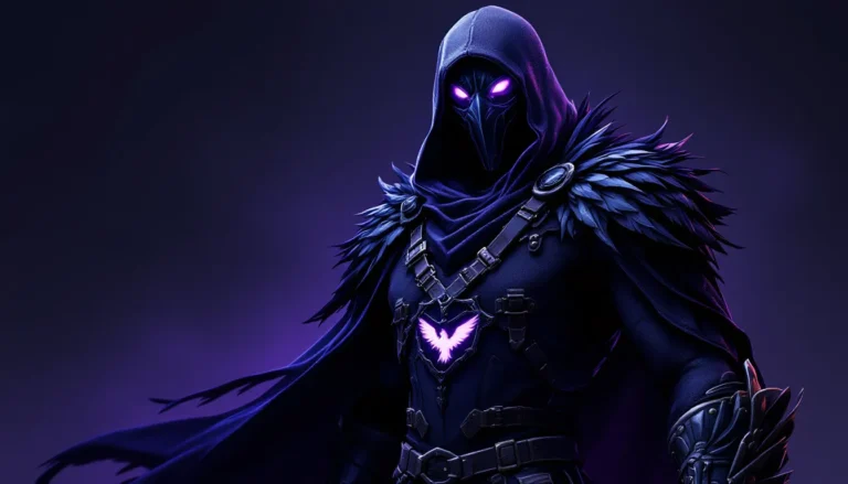
The character or skin you feature should dominate the frame. Most high-performing thumbnails place the Fortnite character off-center (rule of thirds applies here), creating negative space for text or effects. Action shots work best, mid-air shotgun pump, cranking 90s, or a Victory Royale emote. Static lobby poses feel flat and forgettable.
Skin choice matters more than you’d think. OG skins like Black Knight or Renegade Raider signal legacy and skill. Collab skins (Marvel, Star Wars, anime crossovers) tap into fanbases outside Fortnite’s core audience, which can boost CTR if your montage features those cosmetics. Newer or trending skins from the current Battle Pass keep your content feeling fresh and relevant to active players.
Layering is critical. Don’t just drop a PNG of your character onto a background and call it done. Add depth with shadow effects, edge glow, or subtle motion blur to make the character feel integrated into the composition. The goal is dynamic energy, viewers should feel the movement even in a still image.
Typography and Text Overlay Strategies
Text is where most amateur thumbnails fall apart. If your font looks like it came from a free Canva template and nobody’s customized it, viewers can tell. Bold, chunky fonts with strong outlines or drop shadows ensure readability at thumbnail size (which is tiny on mobile). Avoid script or overly stylized fonts that become illegible when scaled down.
Keep your word count low. Three to five words max. Think “INSANE SNIPES” or “ZERO BUILD DOMINATION” rather than “Check Out My Awesome Fortnite Montage.” The text should amplify the visual, not explain it. Use color contrast, white or yellow text with black/dark outlines pops on almost any background.
Placement matters just as much as the font itself. Text typically goes in the upper third or lower third of the frame, never dead center (that’s where YouTube’s play button and timestamp overlay sit). Some creators angle text slightly or use a subtle 3D effect to add dimension, but don’t overdo it, readability always wins over flash.
Color Psychology and Visual Contrast
Fortnite’s color palette is naturally vibrant, but your thumbnail needs to punch even harder. High contrast between your subject and background makes the thumbnail readable at a glance. If your background is dark (storm clouds, nighttime POI), use bright neon accents or rim lighting on the character. If it’s a bright background (sunny sky, colorful POI), darker outlines and shadows keep the character from blending in.
Color psychology isn’t pseudoscience here, it’s pattern recognition. Red and orange signal intensity, danger, and action (perfect for aggressive fragmovies). Blue and purple feel futuristic and slick (good for Zero Build or competitive content). Green and yellow are high-energy and optimistic (casual or comedic montages). Many top Fortnite thumbnails from creators covering gameplay styles use complementary color schemes (orange/blue, red/green) because the contrast is biologically easier for our eyes to process.
Don’t be afraid to crank saturation and sharpness higher than you would for a normal photo edit. Thumbnails need to fight for attention in a sea of equally loud visuals, subtlety is a liability.
Best Tools and Software for Creating Fortnite Montage Thumbnails
Photoshop and Advanced Design Options
Adobe Photoshop remains the industry standard for a reason. Full layer control, blending modes, advanced masking, and plugin support give you near-unlimited creative freedom. If you’re serious about thumbnail design, especially if you’re building a brand or planning to monetize, Photoshop’s worth the learning curve and the $10/month subscription.
Key Photoshop features for thumbnails: Pen Tool for clean cutouts (removing backgrounds from character screenshots), Layer Styles for glows and outlines, Adjustment Layers for color grading, and Smart Objects so you can scale elements without losing quality. The Liquify Tool can exaggerate proportions slightly (bigger head, more dramatic pose) for a cartoony, eye-catching effect that’s popular in 2026’s thumbnail meta.
Photoshop also plays nice with plugin ecosystems. Tools like Topaz for upscaling, Boris FX for effects, and Astute Graphics for vector elements can elevate your designs if you’re pushing into pro-tier content. Designers covering tutorials on visual workflows often recommend Photoshop for creators who plan to iterate and improve over time.
Free and Beginner-Friendly Alternatives
Not everyone wants to drop cash on Adobe, and honestly, you don’t need to when starting out. Photopea is a browser-based Photoshop clone that’s shockingly capable, same layer system, same tools, completely free. The interface is nearly identical to Photoshop, so if you ever upgrade, the transition is seamless.
GIMP is the open-source heavyweight. It’s free, works on PC/Mac/Linux, and handles most tasks Photoshop can (though the UI is clunkier). GIMP’s learning curve is steeper than Photopea’s, but once you dial in your workflow, it’s more than enough for high-quality thumbnails.
For mobile creators, Pixellab (Android) and Phonto (iOS) are surprisingly solid. You’re limited compared to desktop tools, but if you’re grinding out thumbnails between matches, they’ll get the job done. Both support custom fonts, layer effects, and PNG imports.
Canva deserves a mention, though it’s controversial among designers. The templates are convenient, but they’re also overused, viewers can spot a Canva thumbnail from a mile away. If you use Canva, heavily customize the templates or start from scratch. Otherwise, your thumbnail screams “low effort” even if the montage slaps.
Step-by-Step Process to Design Your First Montage Thumbnail
Selecting the Perfect Screenshot or Clip
Your source material makes or breaks the design. Boot up Fortnite’s Replay Mode and scrub through your best moments. Look for frames with clear character visibility, dynamic poses (mid-air, mid-combat, mid-emote), and clean backgrounds. Avoid cluttered scenes where your character gets lost in the environment.
Screenshot at the highest resolution your system allows, ideally 1920×1080 or higher. Even if your thumbnail exports at 1280×720, starting with high-res assets gives you room to crop, zoom, and adjust without losing quality. If you’re on console, use the system’s native screenshot function rather than recording from your phone (yes, people still do this, and yes, it looks terrible).
Consider the skin and weapon combo. A recognizable skin holding a meta weapon (currently the Nemesis AR and Thunder Shotgun dominate in Chapter 5 Season 2) instantly communicates skill and relevance. If you hit a nutty clip with a meme weapon like the Boom Sniper, feature that, it’s a conversation starter.
Adding Effects, Filters, and Enhancements
Start with color grading. Bump up contrast, increase saturation slightly, and adjust levels so your character pops against the background. Most pros add a subtle vignette (darkened edges) to draw the eye toward the center of the frame.
For effects, less is usually more, but Fortnite thumbnails are one place you can get away with going a bit wild. Popular effects in 2026 include particle overlays (sparks, lightning, energy bursts), lens flares, and chromatic aberration (that glitchy RGB split effect). These signal high-energy gameplay without overwhelming the composition.
Don’t sleep on motion blur and speed lines. Even though it’s a static image, directional blur around your character or weapon creates a sense of momentum. Tutorials on visual enhancement techniques often cover these effects for gaming thumbnails specifically.
If you’re adding a background (replacing the in-game one), make sure it complements rather than competes. Blurred Fortnite POI screenshots, abstract gradients, or simple solid colors work better than busy patterns. The character should always be the hero element.
Finalizing Dimensions and Export Settings
YouTube thumbnails are 1280×720 pixels (16:9 aspect ratio), with a 2MB file size limit. TikTok and Instagram prefer 1080×1920 (9:16 vertical), but if you’re primarily targeting YouTube, design for 16:9.
Before exporting, zoom out and view your thumbnail at actual size (about the size of a credit card on desktop, smaller on mobile). If text isn’t immediately readable or the character doesn’t stand out, adjust. Many beginners design at full screen and forget that thumbnails are viewed tiny.
Export as JPG at 90% quality. PNG files are technically higher quality but often exceed the 2MB limit once effects and text are layered in. JPG compression at 90% is visually indistinguishable while keeping file size in check. Name your file descriptively (“fortnite_montage_thumbnail_v3.jpg”) so you can track versions if you’re A/B testing.
Trending Thumbnail Styles in the Fortnite Community
Glitch and Cyberpunk Aesthetics
This style exploded in late 2025 and shows no signs of slowing down. Think neon pinks, electric blues, and digital glitch effects, RGB splits, scan lines, pixelation, and datamoshing. It taps into the cyberpunk/dystopian vibe that’s huge across gaming and pop culture right now.
Fortnite’s Neon Noir and Cyber Infiltration sets fit this aesthetic perfectly, but you can apply the style to any skin. The key is high contrast, sharp edges, and techy overlays (HUD elements, code snippets, digital artifacts). This style works especially well for competitive or high-skill montages where you want to project a futuristic, cutting-edge image.
Tools like Glitch Lab (mobile) or Photoshop’s Displace and Wave filters make these effects accessible even to beginners. Just don’t overdo it, too much glitch becomes visual noise.
Minimalist and Clean Designs
The pendulum always swings. While maximalist, effect-heavy thumbnails dominated 2023-2024, minimalist designs have carved out a niche in 2026. These thumbnails strip everything down to essentials: character, one or two words, solid background, maybe a subtle geometric accent.
Minimalism works best for creators with established audiences who don’t need to shout for attention. It signals confidence, “my gameplay speaks for itself.” Color choice becomes critical here since you’re not relying on effects to grab the eye. Bold, contrasting duos (black/yellow, white/red, dark purple/cyan) are common.
This style also ages better. Overly trendy effects date your content fast, but a clean, timeless design keeps your montage looking fresh a year later. If you’re building a content library around the game’s evolution, minimalist thumbnails maintain cohesion across uploads.
Explosive Action and Motion Blur Effects
This is the traditional fragmovie aesthetic, and it’s still dominant for good reason, it works. These thumbnails feature exaggerated action (mid-shotgun-blast, explosion behind the character, building pieces flying everywhere), aggressive motion blur, and particle effects cranked to 11.
The composition usually places the character front and center, often slightly tilted (“Dutch angle”) to add dynamism. Background elements are heavily blurred or obscured to keep focus on the action. Text is bold and angled, often with a glowing or metallic finish.
This style converts well because it immediately communicates intensity. Viewers know they’re about to watch fast-paced, aggressive gameplay. If your montage features a lot of close-range combat, high eliminations, or flashy edits, this thumbnail style aligns perfectly with audience expectations.
Common Mistakes to Avoid When Designing Montage Thumbnails
Cluttered compositions kill more thumbnails than bad color choices. Beginners cram too many elements, multiple characters, excessive text, overlapping effects, because they think “more = better.” It doesn’t. Thumbnails are viewed at stamp size: if there’s too much going on, the eye doesn’t know where to focus, and viewers scroll past.
Low-contrast text is the second most common mistake. Light gray text on a white background, or dark blue on black, these might look fine at full resolution but become unreadable at thumbnail size. Always check contrast at actual viewing size. If you squint and can’t read it immediately, it’s not working.
Overusing trends without understanding them makes your content feel derivative. Just because glitch effects are hot right now doesn’t mean they fit every montage. If you’re showcasing chill Zero Build gameplay or funny moments, a cyberpunk glitch aesthetic sends the wrong message. Match style to content.
Ignoring mobile viewers is a critical oversight in 2026. Over 60% of YouTube views happen on mobile devices, where thumbnails are even smaller. What looks great on your desktop monitor might be an indecipherable mess on a phone screen. Design for the smallest display, always.
Generic stock backgrounds scream amateur hour. If your background is a random explosion or lens flare pulled from a free stock site that ten thousand other creators have also used, your thumbnail blends into the crowd. Custom backgrounds (even simple gradients) or actual Fortnite screenshots instantly improve authenticity.
Finally, forgetting the play button is a rookie mistake. YouTube places a play icon and timestamp in the bottom-right of every thumbnail. If critical text or your character’s face is positioned there, it’ll be covered. Leave that corner clear or design around it.
Advanced Tips to Make Your Thumbnails Stand Out from Competitors
Incorporating Personal Branding and Logos
If you’re serious about growing as a creator, consistent branding transforms random uploads into a recognizable catalog. A small logo or watermark in the same spot across all thumbnails builds visual identity. Viewers scrolling their homepage or recommended feed will start to recognize your style before they even read the title.
Your logo doesn’t need to be complex, a stylized version of your initials, a simple icon, or a unique color scheme works. Place it somewhere unobtrusive (usually a corner) at about 10-15% opacity, enough to be noticed by regular viewers but not distracting to new ones.
Color consistency matters too. Many successful creators stick to a signature palette (specific shade of red, particular neon blue) so their thumbnails have instant visual cohesion. When someone lands on your channel page, they should immediately see a unified aesthetic, not a chaotic mix of styles.
A/B Testing Your Thumbnail Performance
YouTube allows you to test multiple thumbnails against each other (though the feature is still in limited rollout as of 2026). Even without official tools, you can manually test by uploading similar content with different thumbnails and tracking CTR in YouTube Analytics.
Key metrics to watch: CTR (click-through rate) tells you how often people click after seeing your thumbnail. Aim for 8-10% or higher, anything below 4% suggests your thumbnail isn’t working. Average view duration is secondary but important: if CTR is high but watch time is low, your thumbnail might be misleading (clickbait), and viewers bounce once they realize the content doesn’t match the hook.
Run tests on similar content (both ranked or both montages) to isolate the thumbnail variable. Change one element at a time, text vs. no text, one color scheme vs. another, one pose vs. another, so you learn what works, not just if something works. Discussions on thumbnail optimization for gaming content often share CTR benchmarks across different game niches.
Document what works. Keep a swipe file (folder of high-performing thumbnails from your channel and competitors). Over time, you’ll identify patterns, certain angles, color combos, or text placements that consistently convert.
Optimizing Thumbnails for Different Platforms
YouTube and TikTok have fundamentally different thumbnail needs, and designing for one doesn’t automatically work for the other. YouTube thumbnails are landscape (16:9), viewed alongside titles and metadata, and function as the primary hook. Design principles covered earlier (high contrast, bold text, clear focal point) apply most directly here.
TikTok technically doesn’t use custom thumbnails the same way, the platform auto-generates one from your video’s first frame or lets you select a frame. But, if you’re uploading Fortnite montages to TikTok, your opening frame is your thumbnail. Design a static title card or freeze frame at the start of your video that functions as a thumbnail. Keep text centered (since TikTok’s UI doesn’t obstruct the middle) and optimized for vertical viewing (9:16).
Instagram Reels work similarly to TikTok, your cover image should be bold and centered. If you’re cross-posting montages, consider designing a vertical variant of your YouTube thumbnail rather than just cropping the original. Elements that work horizontally (side-by-side text and character) often need repositioning for vertical formats.
Twitch (if you’re posting VODs or highlights) uses horizontal thumbnails similar to YouTube, but the audience skews toward live content and values authenticity over polish. A thumbnail that looks too “produced” can feel out of place. Slightly rawer designs with stream overlays or webcam elements signal the content’s live origin.
One smart workflow: design your primary thumbnail for YouTube at 1280×720, then create vertical and square variants by repositioning elements rather than cropping. This ensures your composition works across platforms without looking like a lazy afterthought. Creators with presence across multiple game genres and platforms often maintain templates for each format to streamline multi-platform uploads.
Conclusion
Your Fortnite montage thumbnail isn’t an afterthought, it’s the gatekeeper between your editing work and actual viewership. In 2026’s hyper-competitive content landscape, a killer thumbnail is just as important as clean gameplay and smooth transitions. The creators pulling 100K+ views aren’t necessarily better players: they’re just better at packaging their content for discovery.
Start with the fundamentals: strong composition, readable text, high contrast, and platform-appropriate dimensions. As you improve, layer in branding, A/B testing, and trend awareness without losing sight of what makes your content unique. The best thumbnails don’t just grab attention, they set accurate expectations, attract the right audience, and build recognizable style over time.
Experiment, track your metrics, and iterate. Your first ten thumbnails will probably suck. That’s fine. By your fiftieth, you’ll have a process dialed in that consistently delivers results. The difference between a montage that dies at 300 views and one that breaks five figures often comes down to those few hours spent designing a thumbnail that actually competes.